
Starting a new business
Build a credible foundation.
- Positioning and naming support where appropriate
- Identity, logo, typography and colour
- Essential launch applications
- Website direction and collateral
Brand identity · Auckland and New Zealand
Vivid Icon creates brand identities and visual systems for new businesses, growing companies and established organisations across Auckland and New Zealand. From positioning and identity through to guidelines, digital, print, packaging and physical implementation, every brand is built for consistent real-world use.
More than a logo
A logo is one part of a brand identity. A usable system also defines how typography, colour, imagery, layout and graphic language work together across customer touchpoints.
The goal is not complexity. It is consistency: the right amount of structure for the business now, with enough flexibility to grow.
Different starting points
Brand work is scoped around the situation rather than forcing every organisation through the same programme.
Starting a new business
Growing business
Established organisation
Selected brand work
A deliberately varied selection showing original identity development and responsible implementation of established brands.
Health / Identity / Cultural Communication
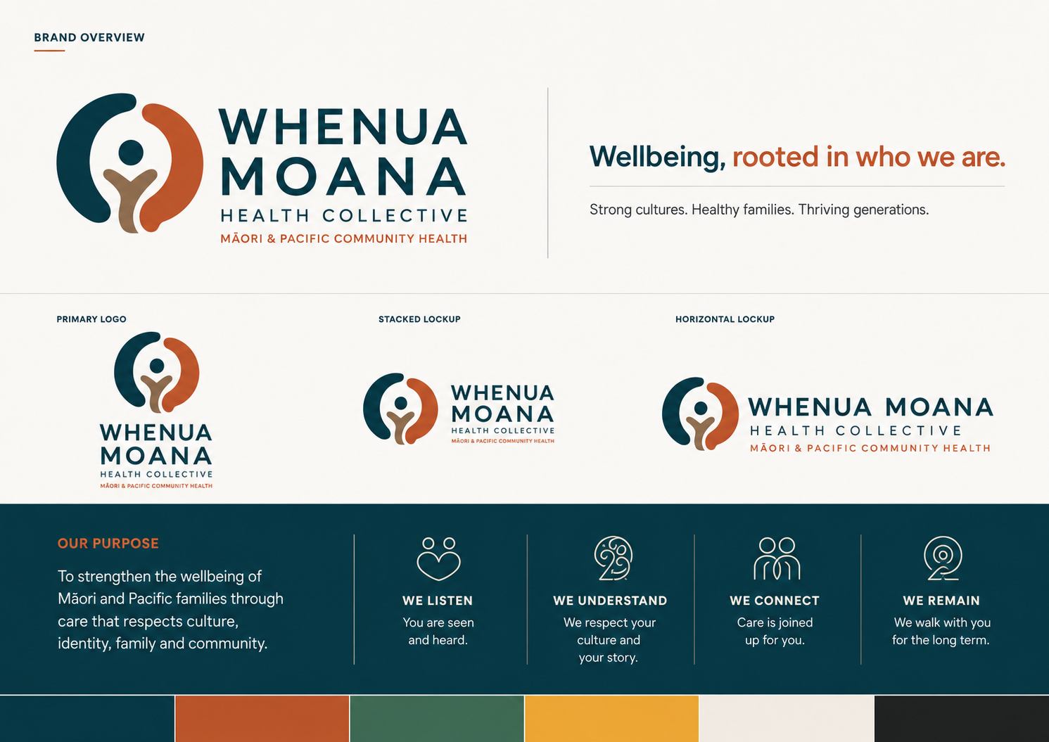
A broader visual identity system bringing together logo, typography, colour, imagery direction, guidelines and communication applications for a Māori and Pacific community health context. The work remains grounded in the client process and appropriate cultural leadership.
View Case Study →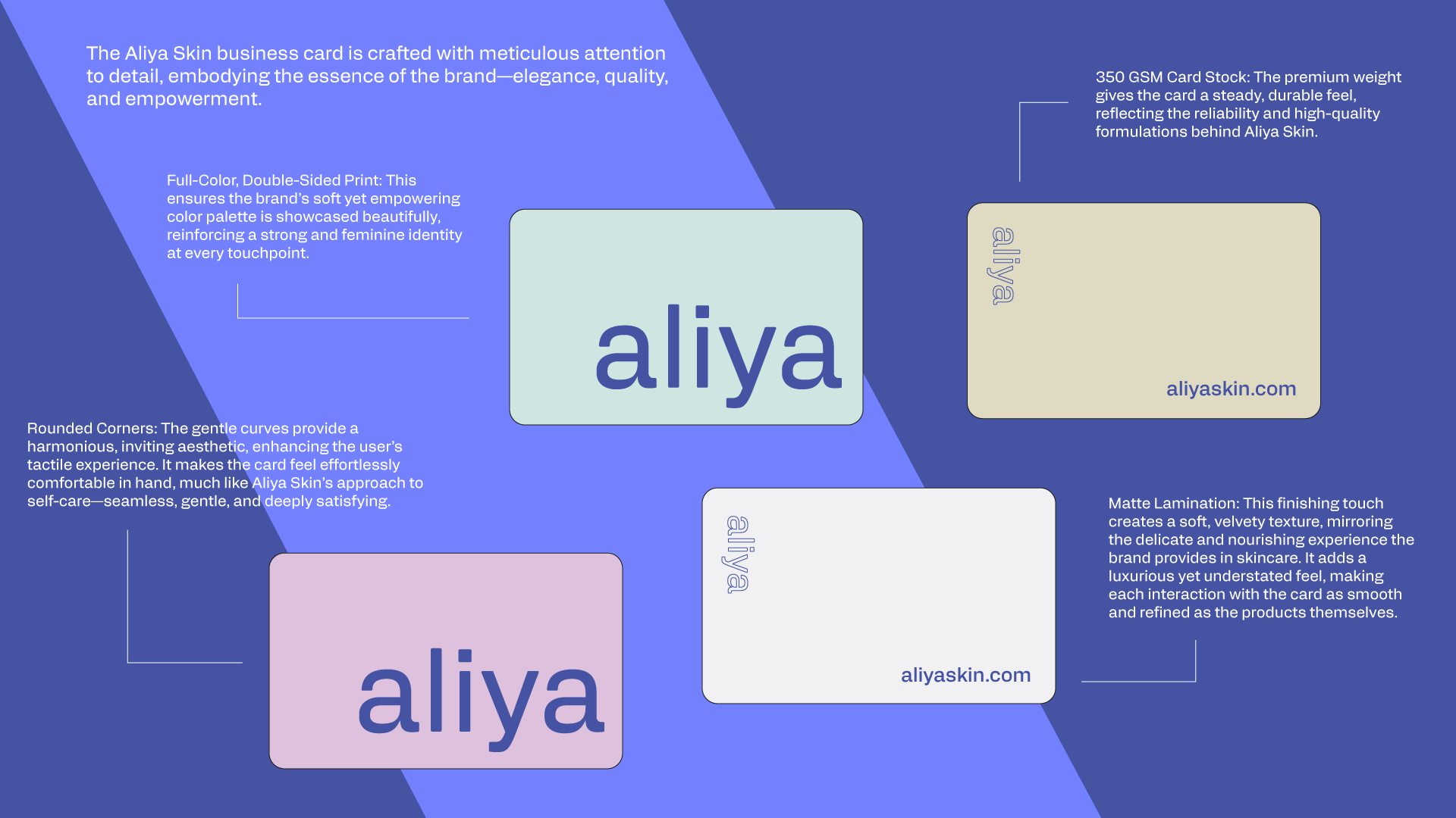
Beauty / Consumer / Digital
A refined visual language carried through typography, colour, packaging, campaign material and ecommerce presentation.
View Case Study →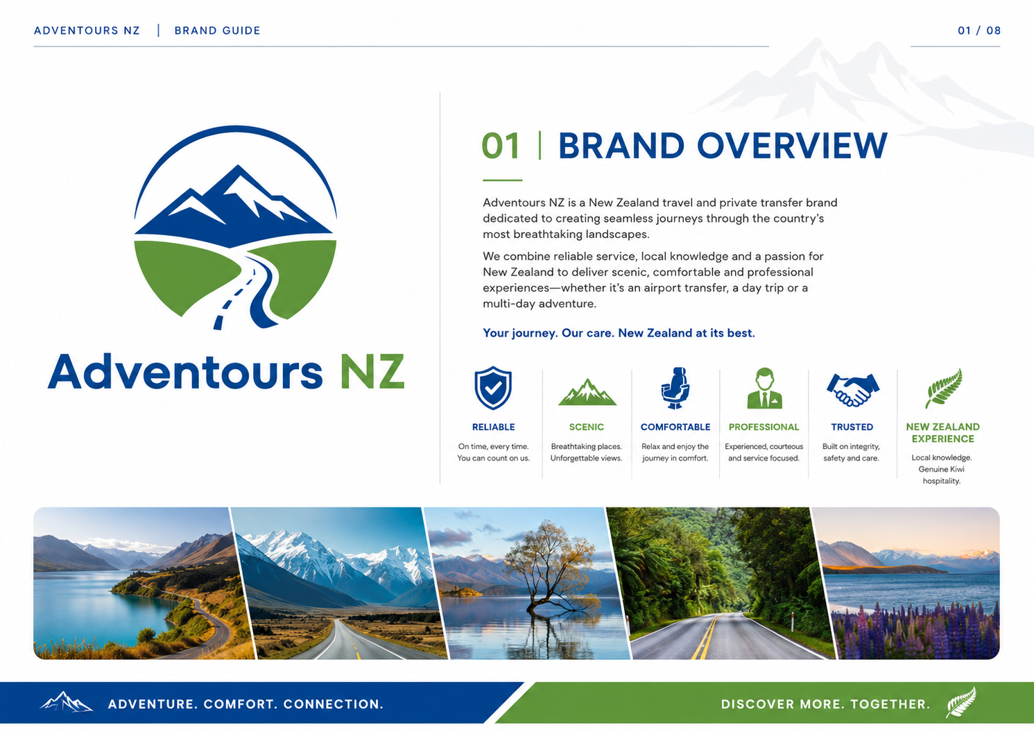
Tourism / Commercial SME
A recognisable tourism identity designed to stay coherent across digital use, destination imagery and launch communication.
View Case Study →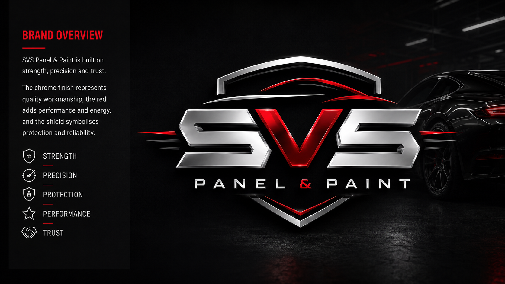
Automotive / Commercial Rollout
Bold recognition carried into vehicle and everyday business applications.
View Case Study →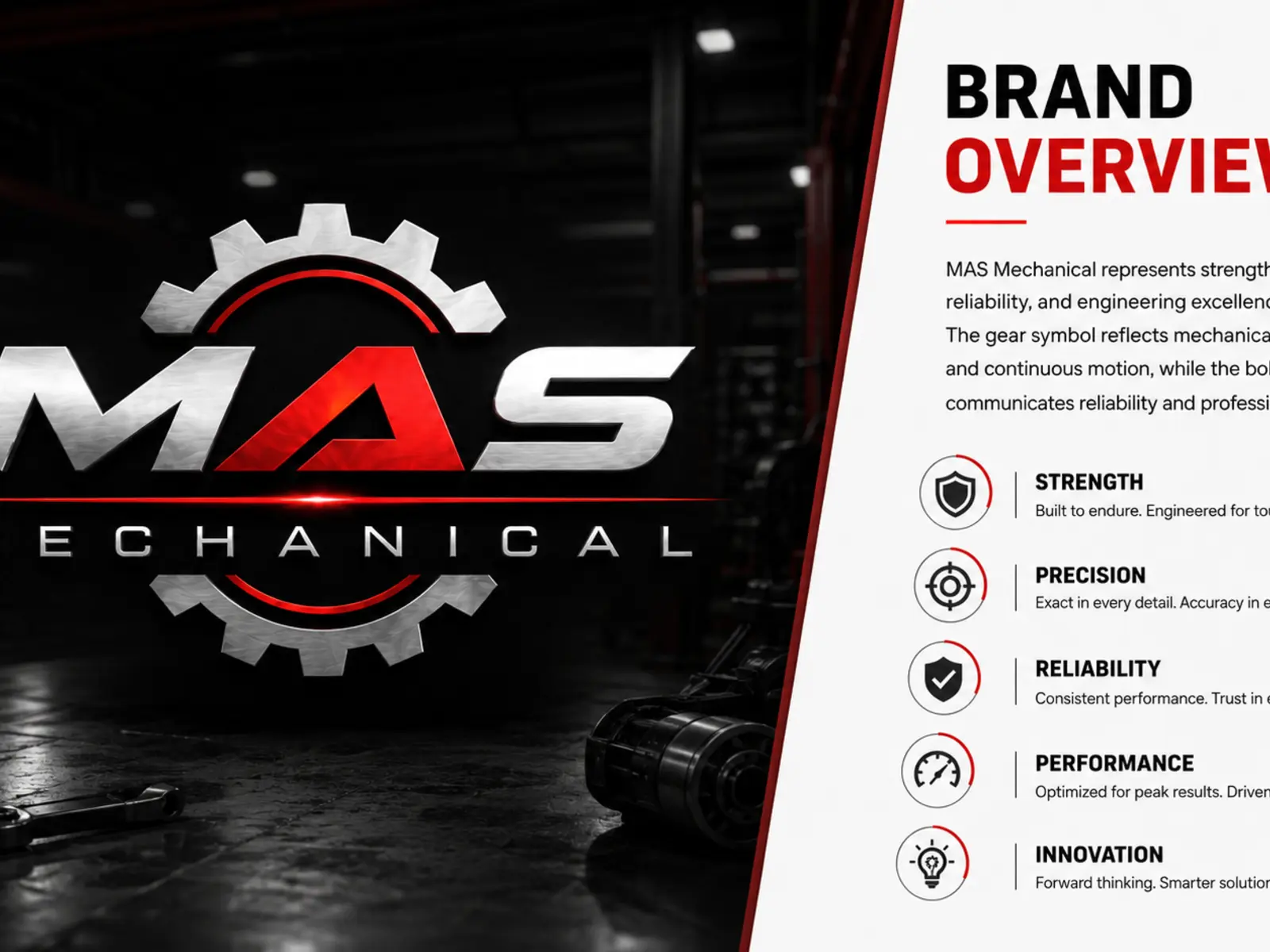
Trade / Industrial SME
A practical identity system supporting a more consistent professional presence.
View Case Study →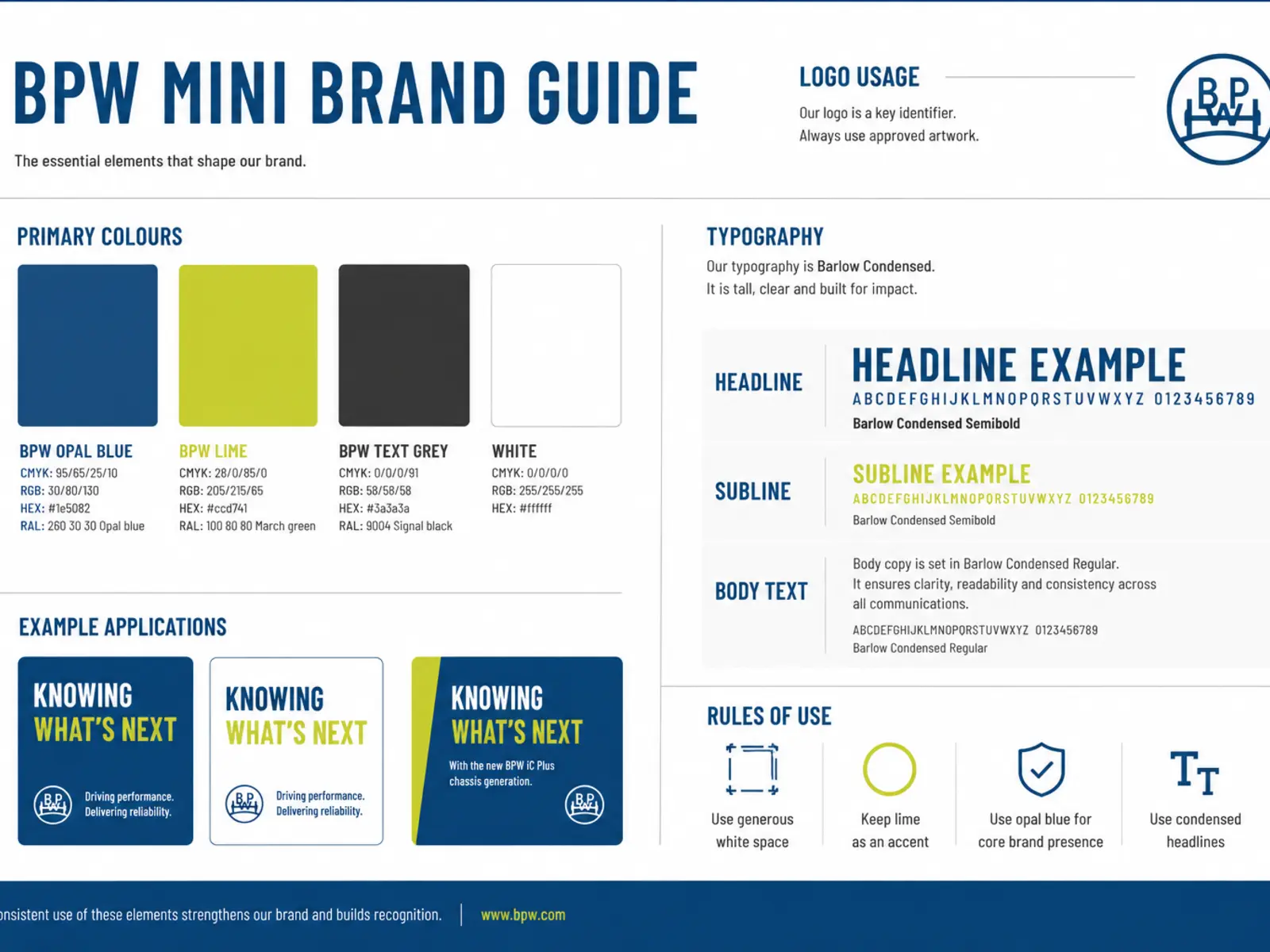
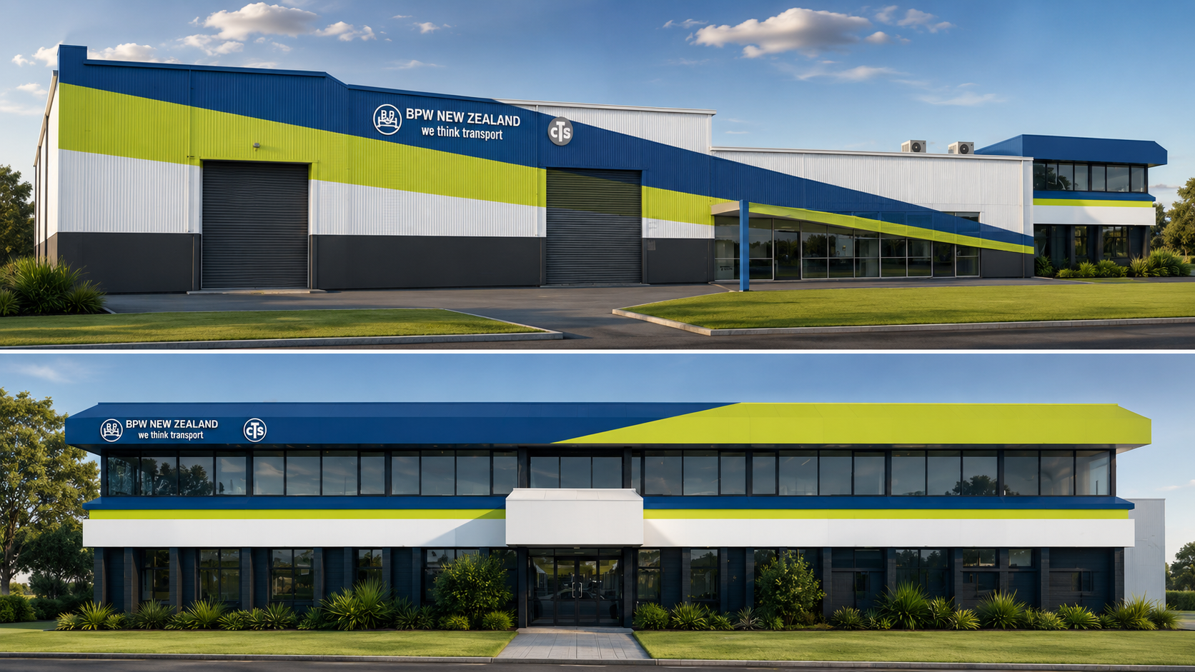
Brand Implementation / Environmental / Production
Local implementation of an established corporate identity across signage, environmental graphics and print. Vivid Icon does not claim authorship of BPW's global identity.
View Case Study →The pieces that make a brand usable
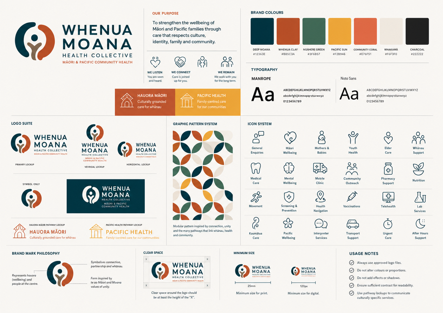
Marks and lockups shaped for different spaces.
A clear hierarchy for headlines, information and body copy.
Defined palettes supporting recognition and production consistency.
Supporting shapes, patterns and image treatment.
Photography direction appropriate to the brand and audience.
Repeatable composition across print and digital communication.
Built to stay consistent
Brand guidelines help internal teams and external partners use an identity consistently. Their depth is matched to the scope: from essential logo, colour and typography rules to fuller application systems.
Branding capabilities
Grounded visual strategy rather than unsupported management-consultancy claims.
01
Audience, differentiation, communication hierarchy and practical brand direction.
02
Logo system, typography, colour, graphic language and imagery direction.
03
Usage rules, specifications, layout guidance and relevant application examples.
04
Digital, packaging, print, publications, campaigns and environmental design.
Designed with implementation in mind
Vivid Icon connects identity design with practical experience across print, packaging, publications, vehicles and environmental graphics. The work accounts for scale, materials, legibility, colour and supplier requirements before handover.
Professional craft is visible in vector construction, typography, colour specifications, guideline pages, image preparation and production artwork—not in a strip of software logos.
A flexible branding process
The depth changes with the project. A lean identity and a complex organisational rollout do not require identical programmes.
Business, audience, goals and current perception.
Positioning and visual direction.
Identity concepts and core system.
Typography, colour, language and applications.
Guidelines and agreed usable assets.
Digital, print, packaging and physical environments where required.
Refresh or rebrand?
Recognition can carry real value. Rebranding is not automatically the right answer.
Brand refresh
Full rebrand
What clients may receive
Not every project needs every item. Deliverables are agreed around the business, immediate rollout and future use.
Depending on scope, final assets may include appropriate AI, EPS, SVG, PDF, PNG and JPG formats, with vector, print and digital files prepared for their intended uses. Need a logo only? That can be scoped too. A complete identity simply goes further when the business needs a connected visual system.
Branding + packaging + digital
For product businesses, identity and packaging often need to develop together. Aliya Skin and Uppers show how brand recognition can extend into packaging, product imagery and ecommerce.
The same typography, colour, imagery, hierarchy and brand language should continue into websites and digital communication without becoming a different visual personality.

Identity shaped by audience, not assumptions
Vivid Icon has extensive experience working with Pacific communities, culturally diverse businesses, migrant organisations, community organisations and mainstream New Zealand companies. That experience informs careful questions and relevant communication; it is not a claim of authority over every culture.
Māori-focused work is developed with respect for appropriate client and cultural leadership, without relying on generic motifs.
Related insights
Existing Vivid Icon articles covering scope, preparation and the difference between a logo and a broader identity.
Brand fundamentals
Understanding where a logo ends and the wider system begins.
Scope and budget
What changes the depth and cost of a professional identity project.
Project preparation
The information that helps a creative project start clearly.
Frequently asked questions
Scope varies with positioning, identity depth, applications, guidelines and rollout. Vivid Icon defines the agreed deliverables before quoting.
A logo-only project may suit a simple need. A complete identity is more appropriate when typography, colour, imagery, applications and guidelines must work together.
Yes. A refresh can retain useful recognition while refining the identity and application system. A full rebrand is considered when the existing identity no longer represents the business or cannot scale.
Yes. Their depth can range from essential logo, colour and typography rules to fuller systems with layout and application examples.
Yes. Vivid Icon can extend agreed identities into websites, ecommerce, packaging, print and environmental design. Specialist signage fabrication and installation are delivered through SignSpot where required.
Depending on scope, final assets may include suitable AI, EPS, SVG, PDF, PNG and JPG files prepared for vector, print and digital use.
Start a brand project
Tell us where the business is now and where you want the brand to take you.
Branding across Auckland. Based in East Tamaki, Vivid Icon works with organisations and businesses throughout Central, East, South, North and West Auckland. View Auckland service areas →