
Packaging Design / Label Design / Product Range
HomeMaid Packaging Design
A cohesive packaging system bringing traditional pickles, chutneys, spices and masala products together under one recognisable HomeMaid identity.
Project overview
One recognisable family across multiple product types.
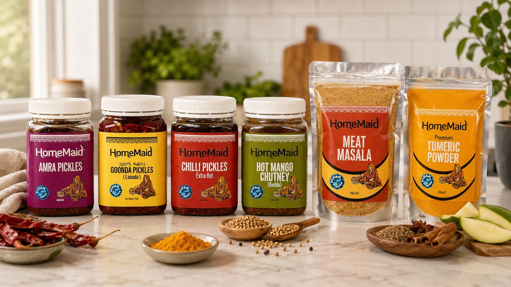
We developed a cohesive packaging design system for HomeMaid, bringing together its range of traditional pickles, chutneys, spices and masala products under one recognisable visual identity.
The objective was to create packaging that feels authentic, approachable and full of flavour while maintaining strong consistency across different product types.
Packaging range
Labels and pouches designed as one family.
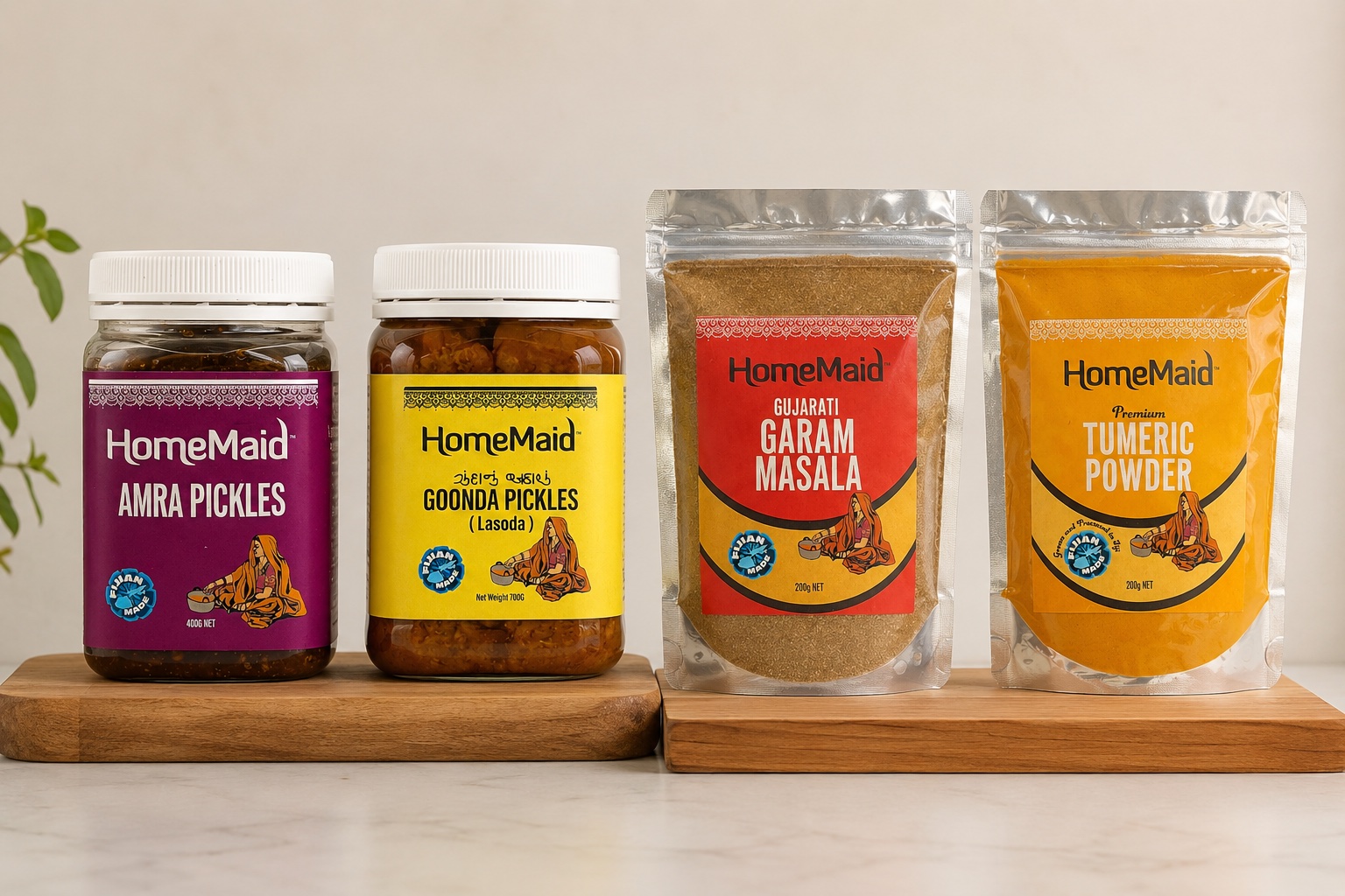
Vivid Icon designed the following packaging and labels for HomeMaid: Chilli Pickles, Amra Pickles, Goonda Pickles, Hot Mango Chutney, Garam Masala, Meat Masala, Chai Masala and Turmeric Powder.
Each product uses its own distinctive colour palette to make flavours easy to identify on the shelf, while the HomeMaid branding, decorative detailing, traditional illustrated character and Fiji Made identity create a consistent family look across the range.
Flexible packaging
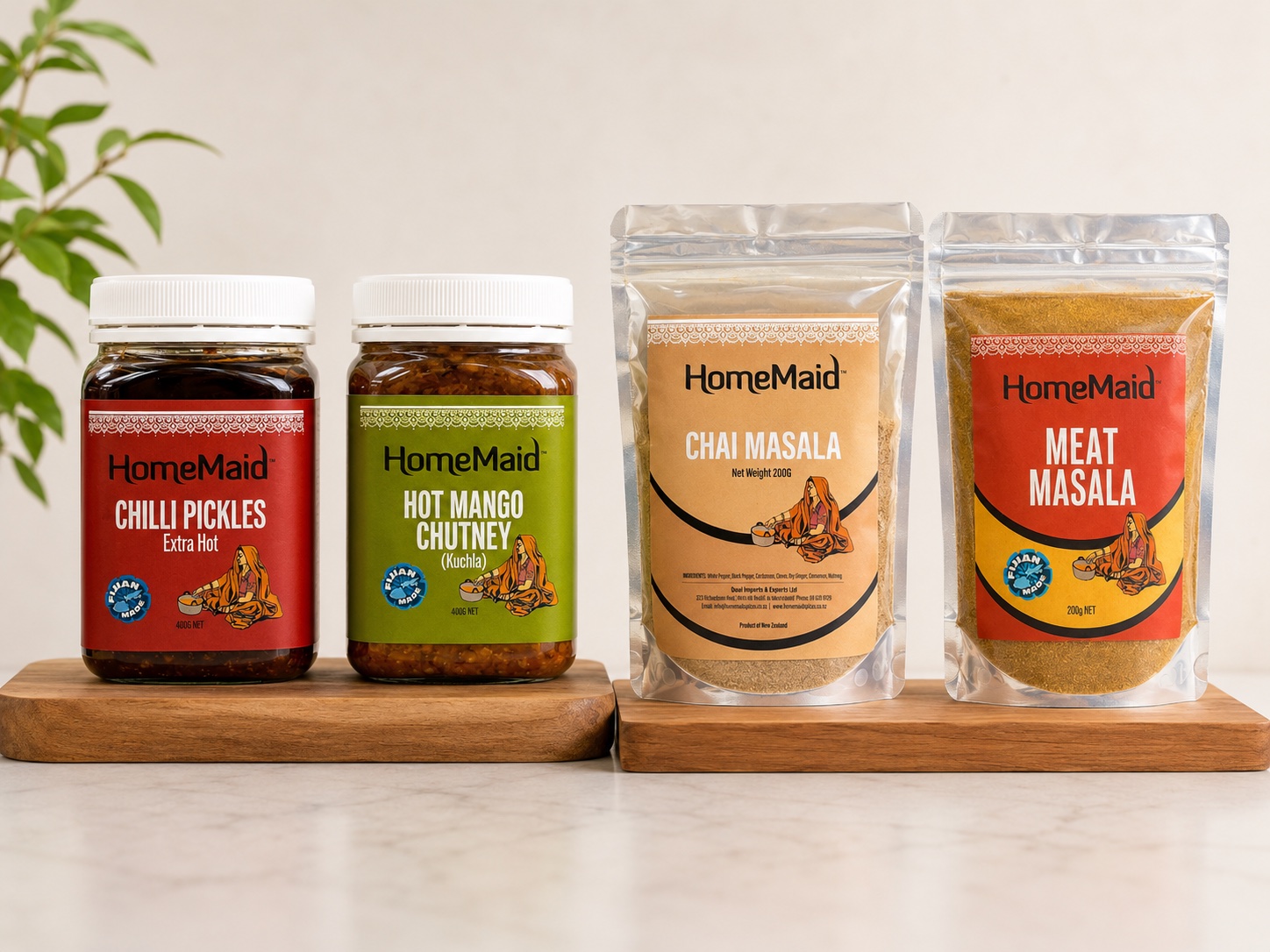
Clear hierarchy across the masala and spice range.
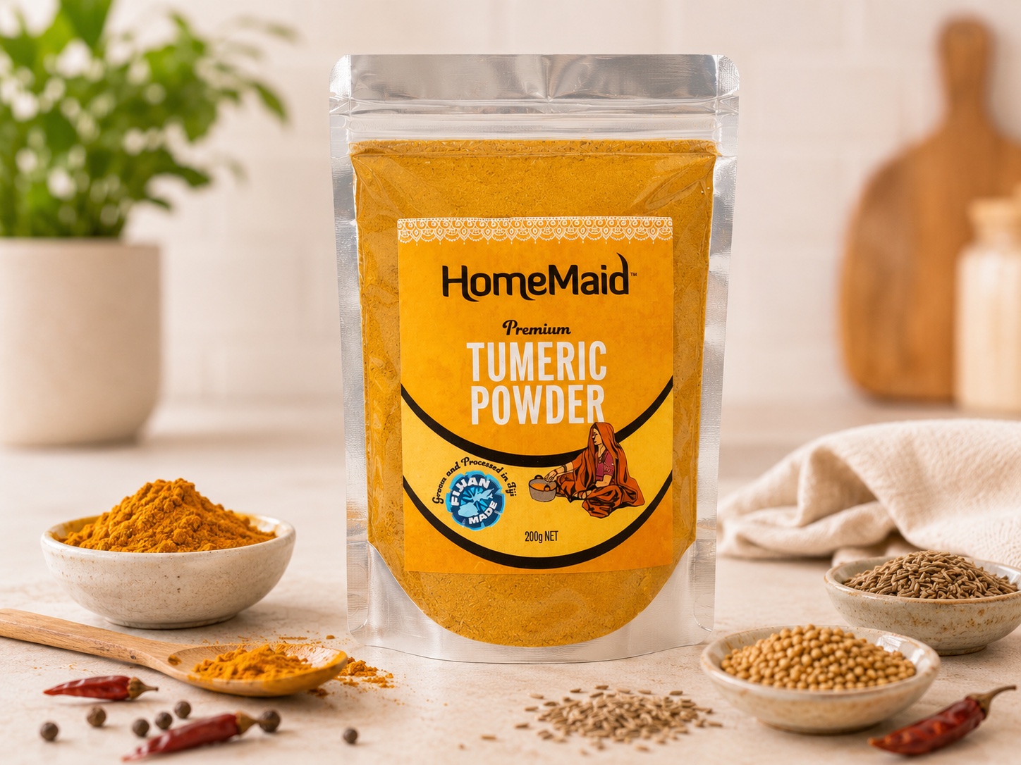
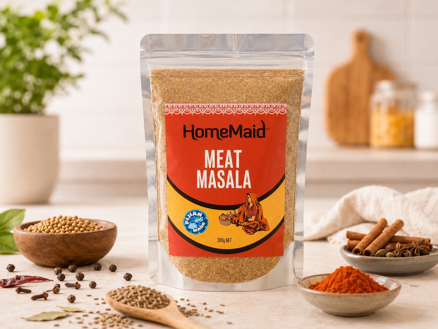
Particular attention was given to typography, colour hierarchy, product naming and label composition so key information remains clear and immediately recognisable on flexible pouches.
Jar labels
Distinct products with a consistent HomeMaid character.
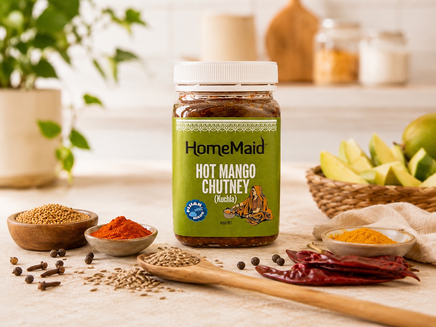
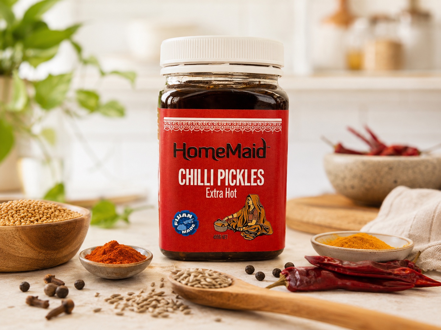
The jar labels balance prominent product naming, flavour-specific colour and appetite cues with the recurring HomeMaid wordmark, illustrated character and Fiji Made identity.
Production artwork
Complete label design, from shelf face to production detail.
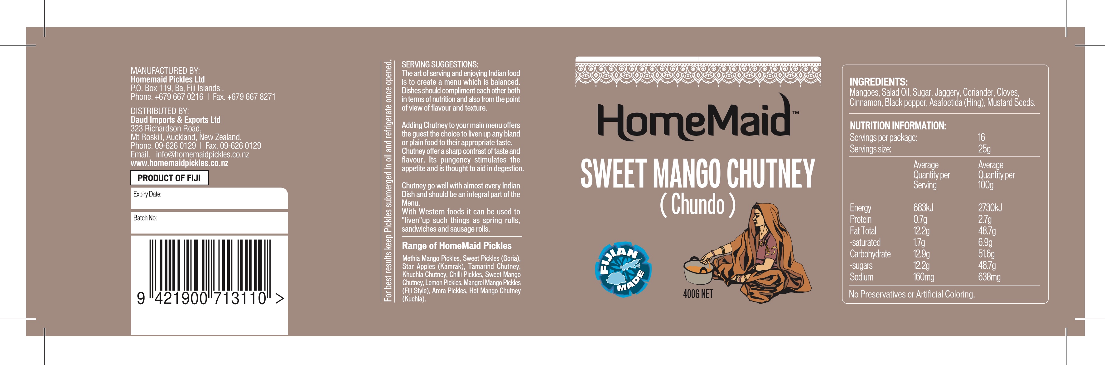
The full wrap label extends the HomeMaid identity beyond the front panel and organises the information required across the complete container label.
The artwork brings together product naming, the Fiji Made identity and illustrated character with ingredients, nutrition information, serving suggestions, barcode, batch and expiry fields, manufacturer and distributor details. Clear spacing and hierarchy keep this information legible while preserving a consistent family look.
Result
A vibrant, versatile packaging family.
A unified identity across jars and flexible pouches.
Distinctive product colours that support quick shelf recognition.
Clear typography and hierarchy across the wider range.
Print-ready packaging and label artwork prepared for production.
The result retains HomeMaid's traditional character while giving the brand a stronger, more unified retail presence.
Related capabilities