Food and retail
Uppers
Brand identity, packaging, campaign
Problem
What needed to change
Uppers needed a snack brand that felt bold, energetic and appetite-led while still communicating a protein product clearly.
Design solution
How we approached it
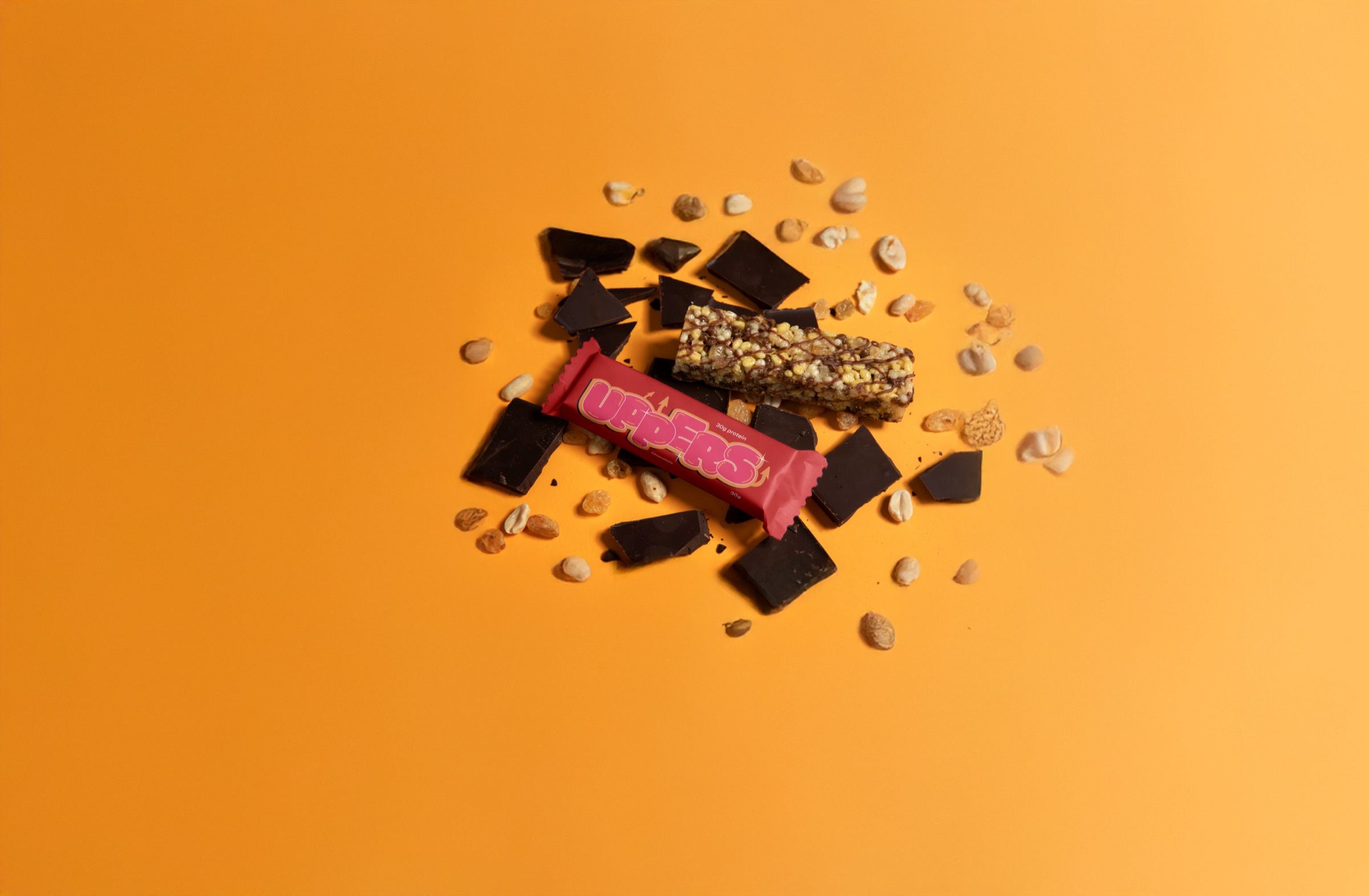
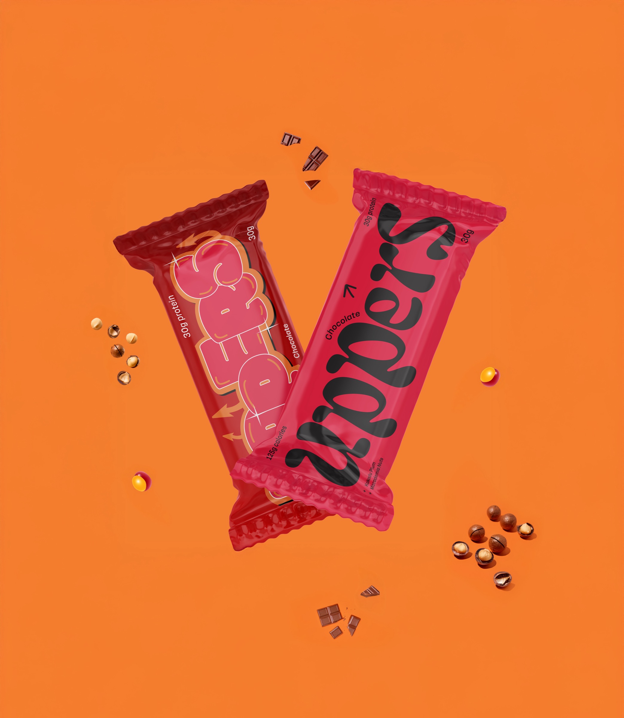
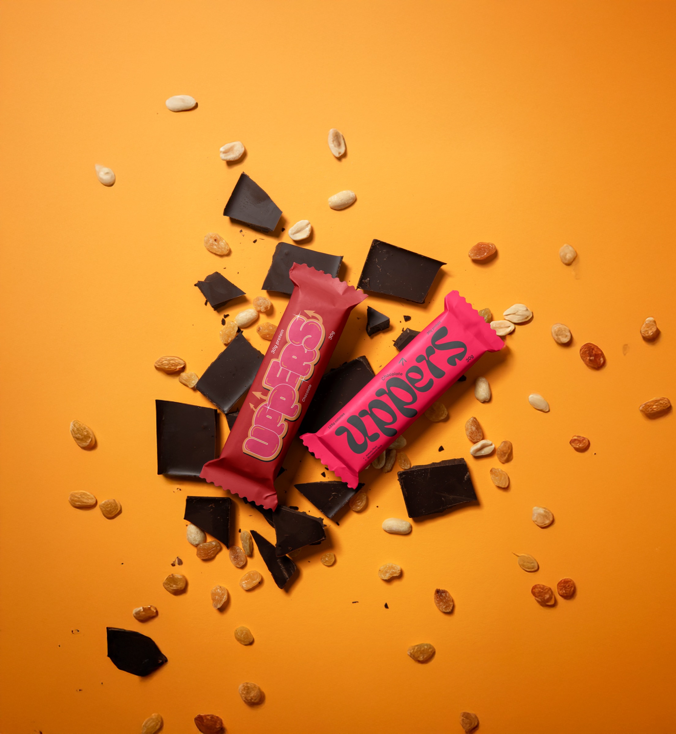
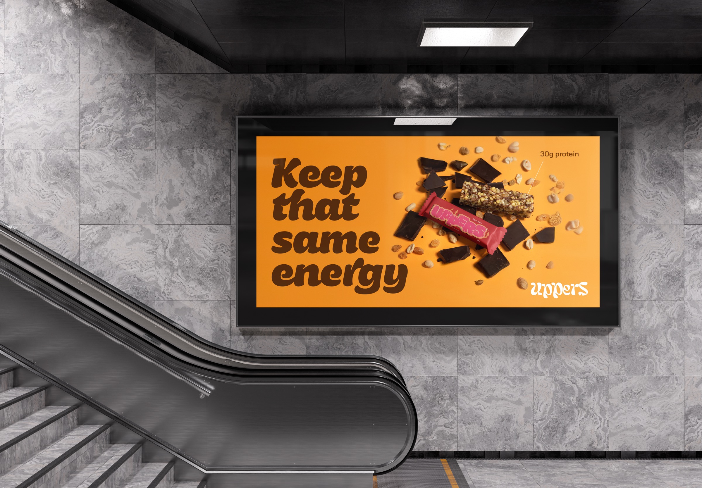
We built a vivid orange-and-red world with punchy product presentation, campaign artwork and packaging visuals designed to stand out in busy retail and social environments.
Execution
What was designed and produced
Vivid Icon delivered Brand identity, Packaging design, Product visuals, Social campaign creative and Out-of-home artwork as part of a connected creative system.
Final outcome
How the work helped
A distinctive snack brand system with strong shelf presence and a personality that can carry from wrapper to billboard.
Design system
How the visual language was built.
The product system used bold colour blocking, appetite-led imagery and direct hierarchy so the bar could be recognised quickly across wrappers, social posts and campaign placements.
Rollout
Where the work needed to perform.
The same visual language was extended into packaging, product visuals, social creative and out-of-home artwork to keep the launch energetic and instantly recognisable.
- Brand identity
- Packaging design
- Product visuals
- Social campaign creative
- Out-of-home artwork
Outcome proof
Practical improvements without inflated claims.
Where exact performance numbers are not available, we focus on clear outcome-based proof: better presentation, clearer customer journeys, stronger shelf presence, improved consistency and more professional launch assets.
What improved
- Stronger brand consistency across the main customer touchpoints.
- More professional presentation for sales, launch and real-world visibility.
- A distinctive snack brand system with strong shelf presence and a personality that can carry from wrapper to billboard.
Visual gallery
Uppers brand touchpoints.
Client feedback
Proof of a more complete brand experience.
The final direction gives the product a confident launch platform across packaging, campaign and digital touchpoints.
"Good design should make a business easier to recognise, trust and choose."
Vivid Icon project note
Build something similar