
Environmental Graphics / Wayfinding / Brand Implementation
Ray White Botany
Making the entrance impossible to miss.
Project introduction
A clearer customer arrival point.
Ray White Botany needed a clearer visual entrance for its automatic glass doorway at Botany Town Centre. The transparent frontage was easy to overlook, particularly from the nearby pedestrian flow.
Vivid Icon was asked to create a practical design response that would make the doorway visually obvious while remaining consistent with Ray White's established corporate identity.
The visibility challenge
An entrance that was too easy to miss.
From a distance, customers did not immediately read the automatic glass section as the office entrance. The location sits slightly inside and to the side of the main walking route, so people leaving the centre could pass without noticing it.
The design needed to make the physical doorway unmistakable and provide a second cue before passing foot traffic moved beyond the office.
Environmental design
Making the doorway part of the brand.
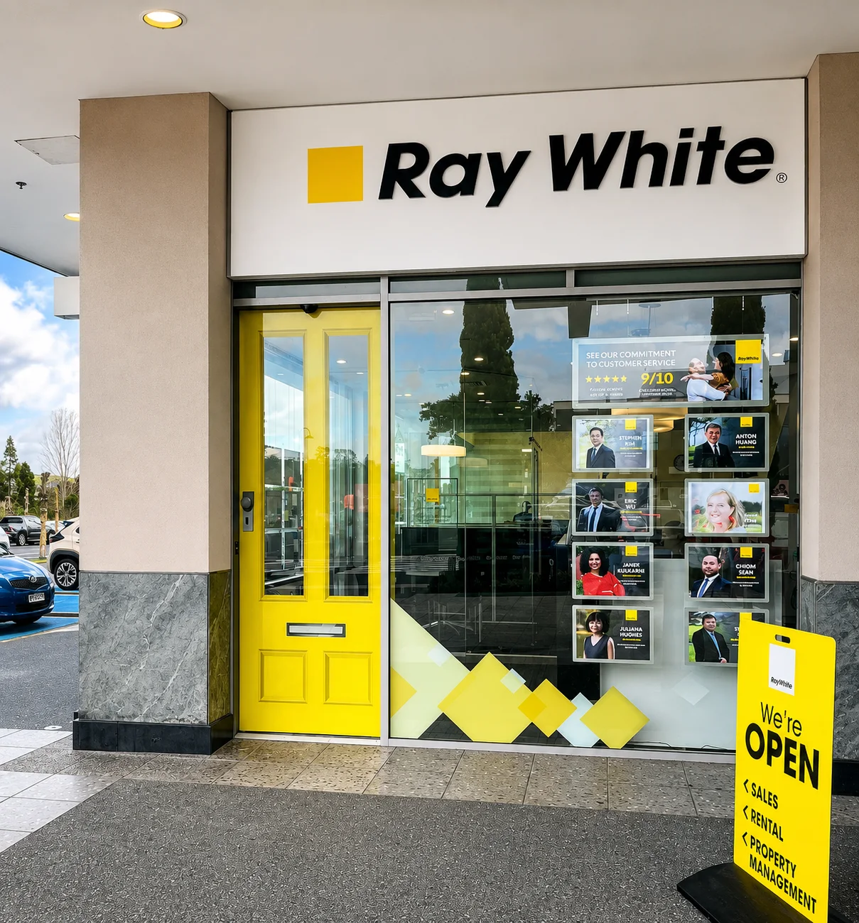
Working within Ray White's established corporate identity, Vivid Icon used the recognisable yellow and existing visual language to turn the full height of the glass entrance into a strong environmental marker.
The solution did not redesign the Ray White identity. Its strength came from applying that identity intelligently to the physical environment and giving the entrance a clear visual job.
Production artwork
Designed for the glass, not just the screen.
The full-height entrance artwork was prepared as a clear printed graphic with a white backing/laminate and installed internally to the glass. This allowed the design to read strongly from outside while keeping the printed face protected behind the glazing.
Production artwork accounted for the scale, glass application and the practical requirements of installation.
Secondary wayfinding
A second cue for passing foot traffic.
Vivid Icon also designed a custom OPEN sandwich board, made slightly taller than a typical standard board for stronger visibility in the mall environment.
Using Ray White's corporate yellow, logo and a large “WE'RE OPEN” message, the board identified Sales, Rental and Property Management and helped signal the office to customers approaching or passing through the centre.
Project outcome
A simple solution with a very practical job.
The full-height door treatment established a stronger branded landmark.
The automatic glass doorway became easier to identify from a distance.
The OPEN board reinforced the office's presence for passing mall traffic.
Together with the existing fascia, the elements created a clearer customer arrival point.