
Environmental Graphics / Wayfinding / Brand Implementation
Mobil Ormiston
Making the forecourt easier to navigate.
Project introduction
Practical information at every point of movement.
Mobil Ormiston approached Vivid Icon to improve several customer-facing areas across the forecourt. Outdoor payment points were easy to miss, the driveway entrance and exit needed stronger visibility, and the car-wash options needed clearer information at the point of decision.
Working within Mobil’s established brand environment, Vivid Icon developed a coordinated system of environmental graphics and wayfinding designed for real-world visibility and use.
Forecourt payment
Making payment obvious.
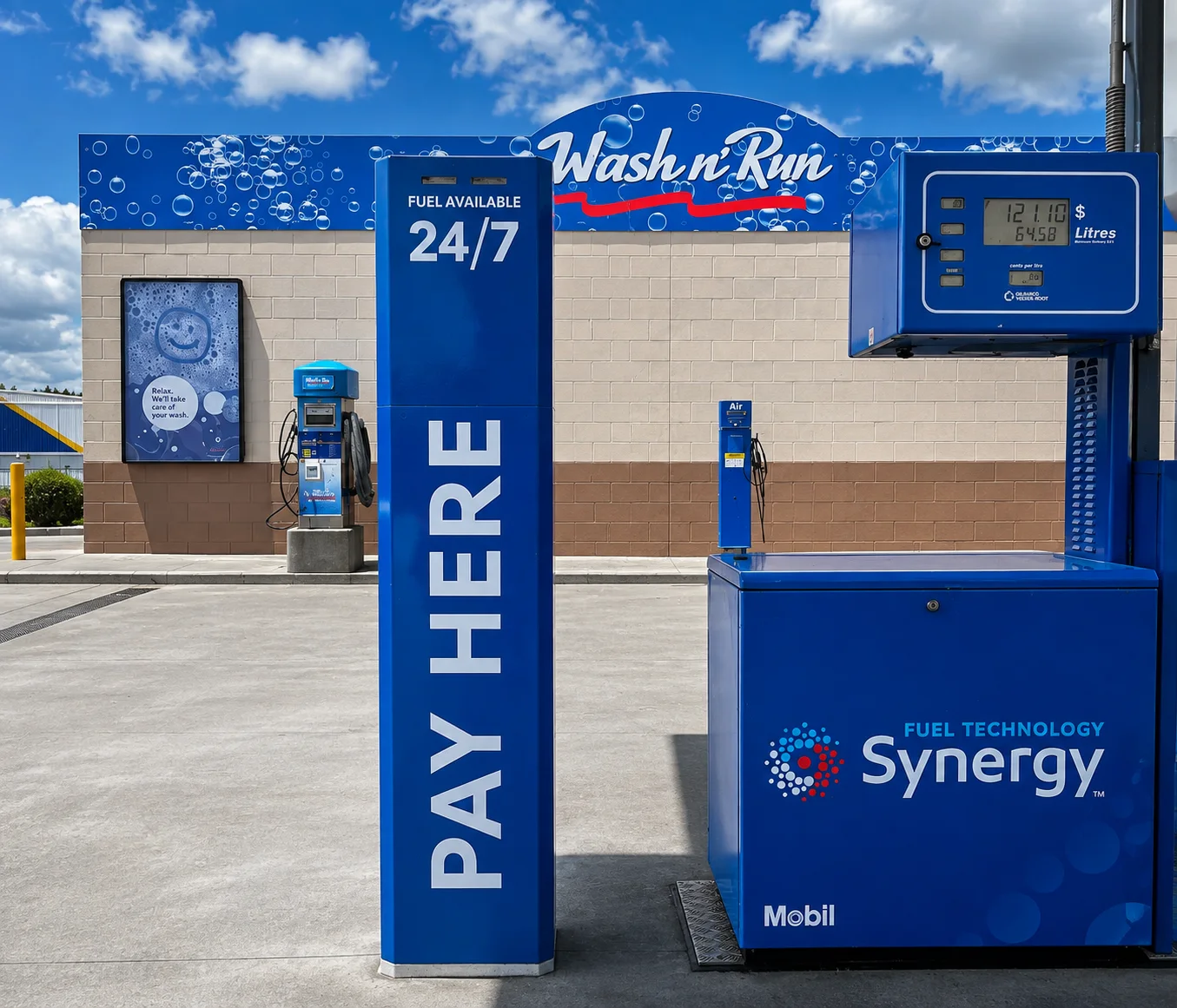
Customers who had finished refuelling were often heading inside because the outdoor payment consoles were not visually obvious enough. The two payment booths were wrapped in Mobil blue and integrated with Mobil and Synergy branding.
Large, high-contrast PAY HERE identification was introduced on both sides so the payment points could be recognised from different approaches across the forecourt. The transformed booths created clearly identifiable outdoor payment destinations.
Vehicle wayfinding
Wayfinding before the driveway.
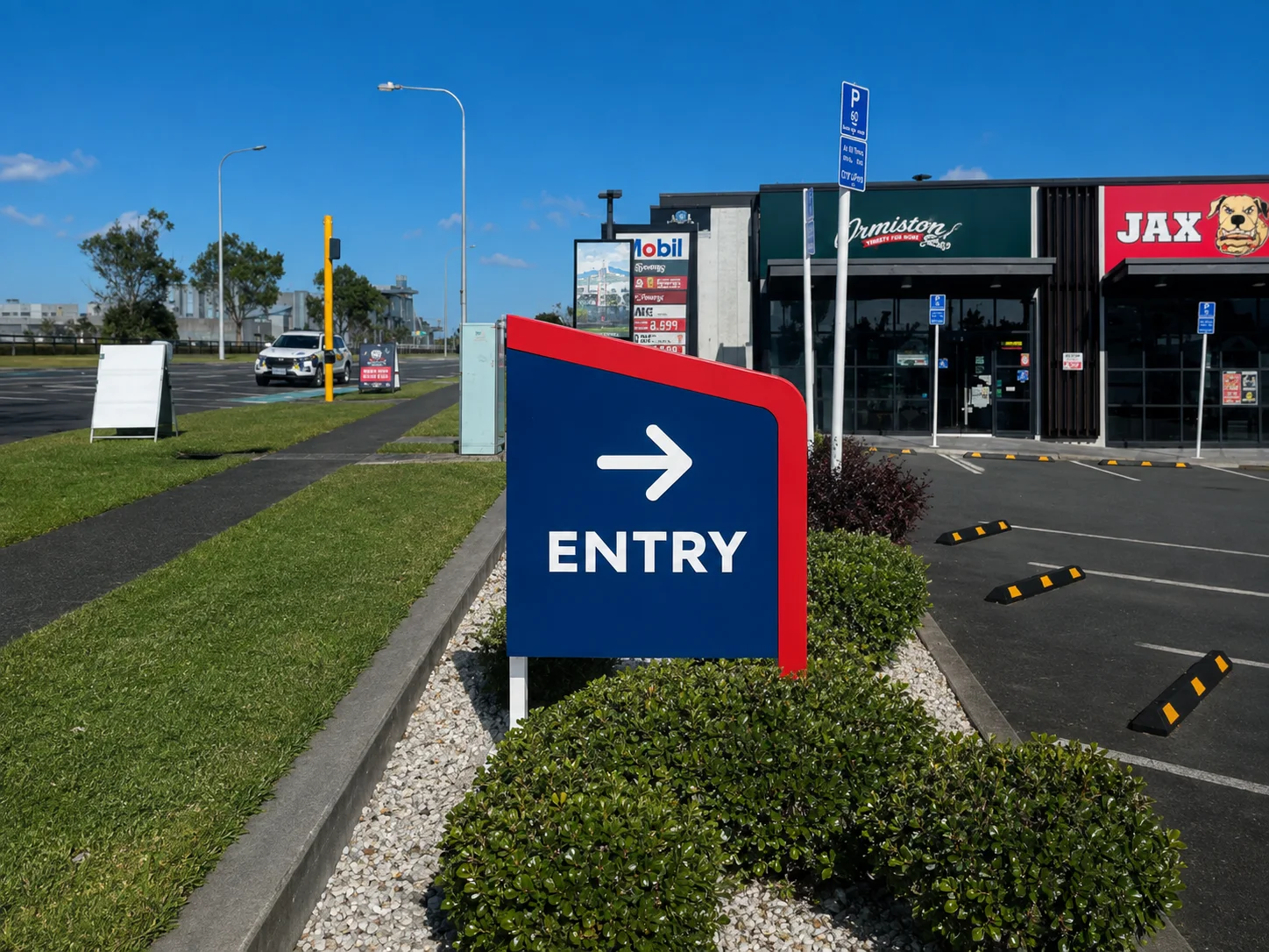
The station’s vehicle entrance and exit identification also needed greater visibility. Drivers needed to recognise the correct access point early enough to position themselves confidently before reaching the driveway.
Vivid Icon developed directional signage using Mobil blue and red with large white ENTRY and EXIT typography. The sign form, contrast and scale create a strong visual landmark while remaining consistent with the established Mobil environment.
Information design
Making the wash options easier to compare.
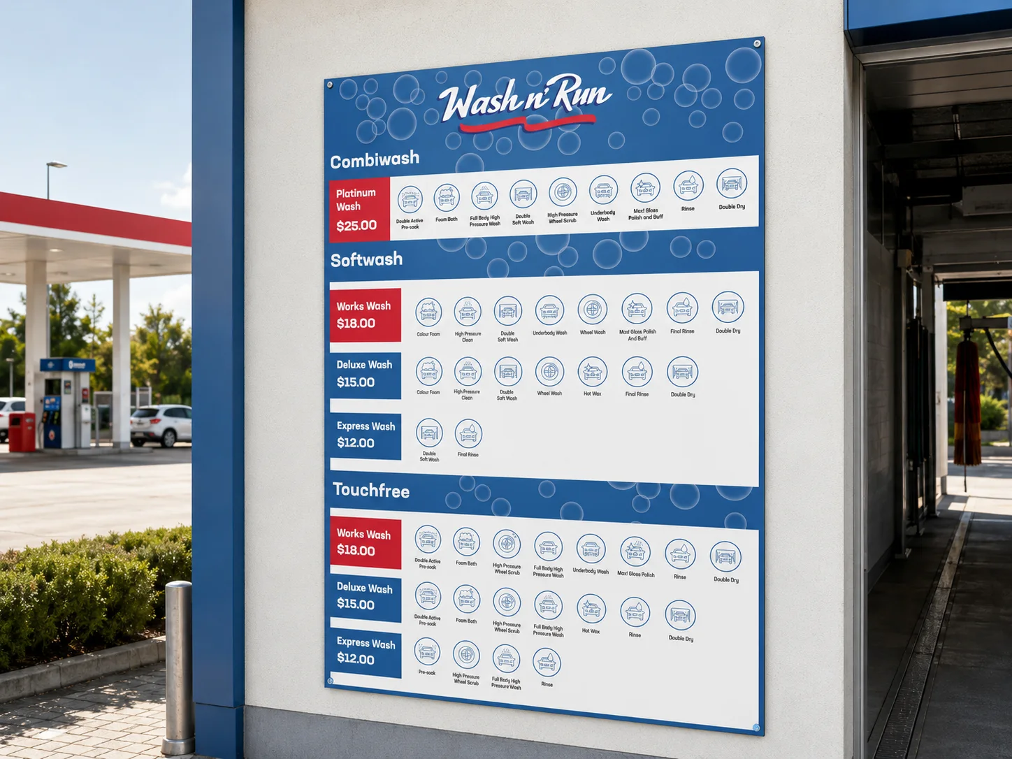
The car-wash area required a clearer way to present available programmes, pricing and included services. Vivid Icon structured the Wash n’ Run board so customers could compare choices quickly at the point of use.
Clear service categories, strong price blocks, consistent iconography and a blue, white and red hierarchy organise the information without relying on small decorative details.
One environmental system
Different customer decisions. One consistent environment.
Each element answered a different question: Where do I pay? Which driveway should I use? Which car-wash option do I want?
Colour, typography, scale and placement were considered in relation to how customers move through the site, allowing separate communication tasks to work as one coherent environmental system.
Established brand environment
Brand implementation without reinventing the brand.
Mobil already has a highly recognisable corporate identity. Vivid Icon’s role was not to redesign Mobil or Synergy, but to apply the established identity intelligently to local customer-experience and wayfinding problems at the Ormiston site.
Mobil blue, Mobil red, white typography and Synergy branding were used as familiar visual cues while new graphics were designed specifically for the physical environment.
Environmental design
Designed to be understood before you arrive.
Viewing distance, type size, contrast, direction, sign profile and environmental placement were considered around driver and pedestrian movement. The objective was clear recognition before each point of decision.
Built for the environment, not just the presentation.
Vivid Icon prepared production artwork for the scale, colour, wrapping and physical sign applications shown, supporting practical manufacture and installation planning without specifying unverified material brands.
Outcome
Clearer cues across the forecourt.
A more visible outdoor payment destination.
Stronger vehicle entry and exit identification.
A clearer information system for car-wash services.
Each element works within the established Mobil environment while responding to a specific customer need.