
Community and publication
SAMA Magazine
Magazine design, print, brand content
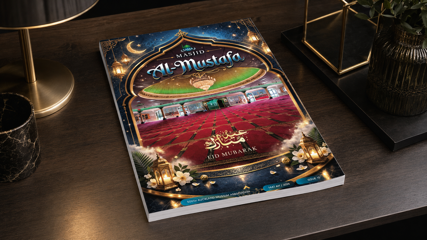
Problem
Different stories needing one editorial rhythm.
The magazine needed a professional, content-rich layout that could carry feature stories, community updates and sponsor content without feeling cluttered.
Design solution
Structuring varied content through a repeatable grid.
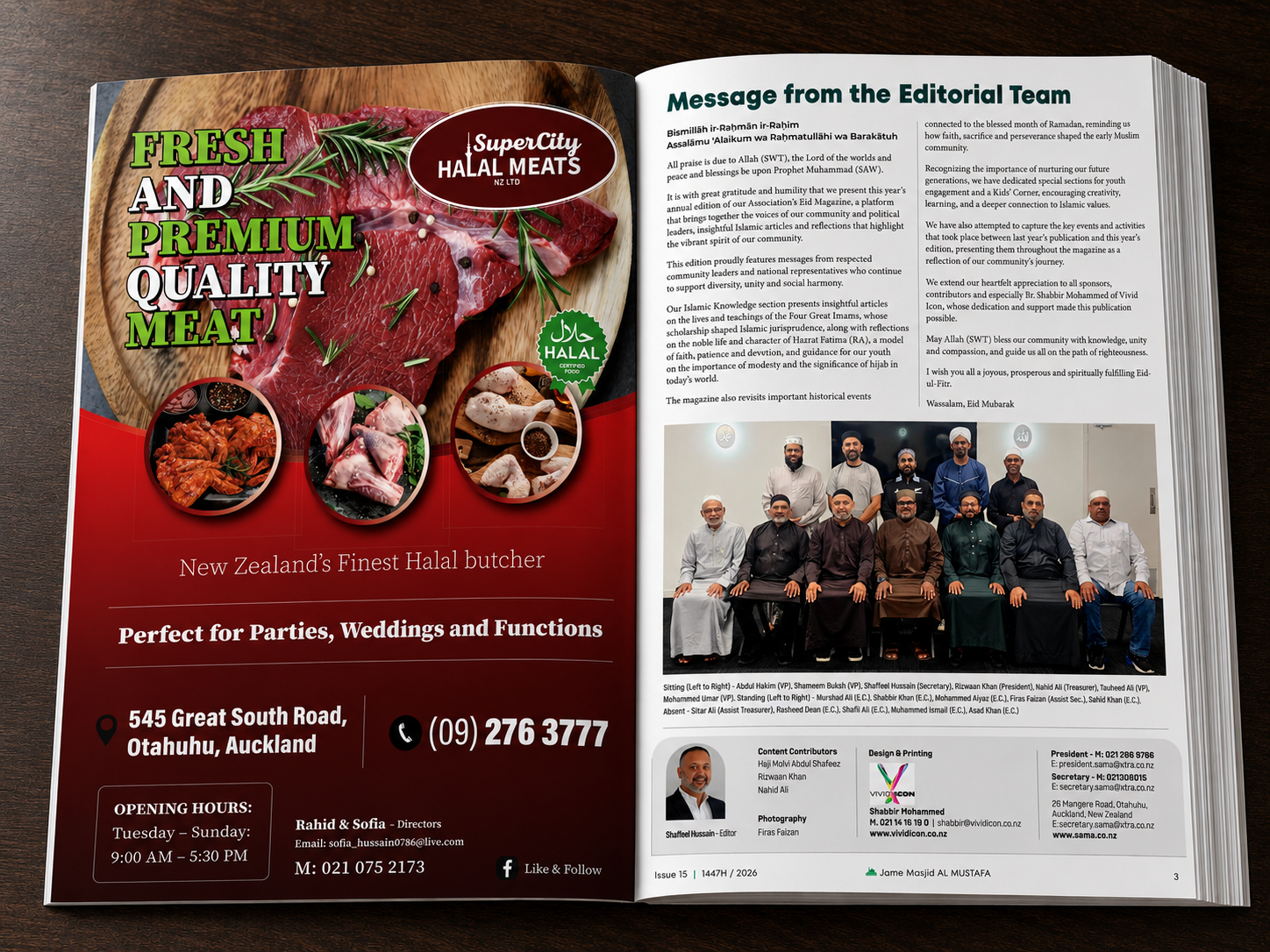
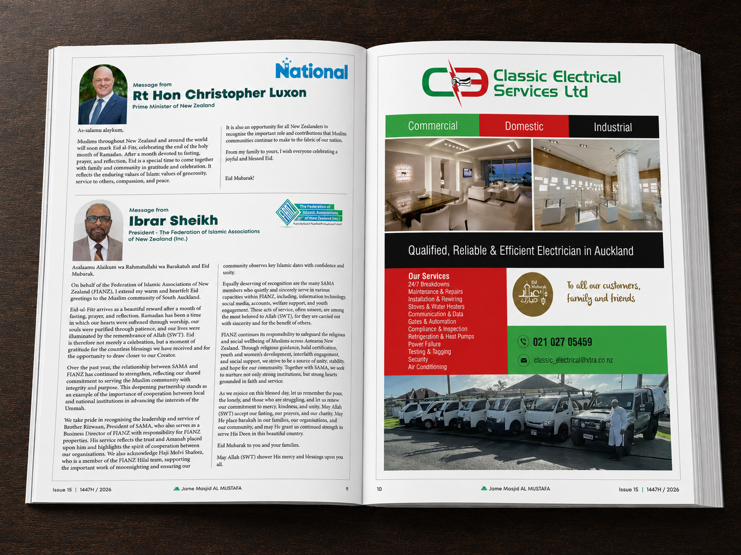
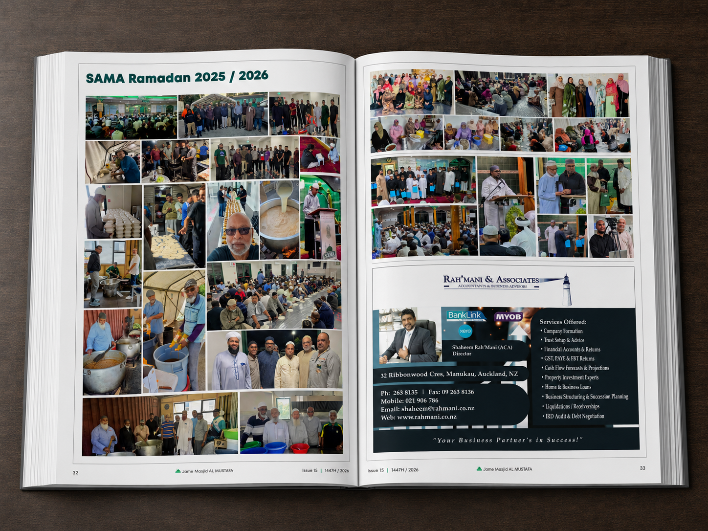
We designed a flexible page system with clear story rhythm, strong pullouts, refined typography and consistent print preparation.
Execution
Publication components prepared for production.
Vivid Icon delivered Magazine design, Print-ready artwork, Page templates, Content layout and Production support as part of a connected creative system.
Final outcome
A reading experience with stronger rhythm.
A more confident publication with stronger visual rhythm and a cleaner reading experience from cover to final page.
Design system
An editorial language shaped around varied stories.
The publication system balanced community warmth with editorial discipline through repeatable page templates, controlled typography and clear spacing rules.
Rollout
Typography and imagery working across each spread.
The design was prepared for ongoing magazine production, allowing stories, sponsor placements and community updates to sit inside a cleaner print-ready framework.
- Magazine design
- Print-ready artwork
- Page templates
- Content layout
- Production support
Project outcome
A clearer framework for the publication.
The project material documents the design work and the applications shown below.
A clearer editorial framework for the magazine.
- Stronger brand consistency across the main customer touchpoints.
- More professional presentation for sales, launch and real-world visibility.
- A more confident publication with stronger visual rhythm and a cleaner reading experience from cover to final page.
Visual gallery
SAMA Magazine brand touchpoints.
Build something similar